When it comes to how we feel and how we experience a place, colour is very important. Colour psychology isn’t just about what looks good; it’s also about how colours make us feel. Every colour makes us feel something, and it can either wake us up or calm us down, start a talk or make us think. If you know how different colours make you feel, you can decorate your home in a way that shows off your style and supports the mood and purpose you want for each room.
How Colour Psychology Works: The Basics
Before getting into specific colours, it’s helpful to know that how we all react to colour is different from person to person. Even though most people feel the same way about certain colours, our cultural background, personal tastes, and life events can change how we see them. Still, designers can use big ideas from colour psychology to help them make places that look good. Most of the time, warm colours make you feel energised and alert, while cool colours make you feel calm and relaxed. Neutrals, on the other hand, can make a room feel more stable or let brighter colours stand out.
How the colour red adds drama and energy
Red is a strong colour that makes people feel passionate, energised, and excited. Inside, it can make a space feel more alive and even make people want to talk and eat, which makes it a popular choice for eating rooms and gathering areas. But red is such a strong colour that using it in large amounts can be too much. As an accent colour, many artists choose red to keep things in balance. This could be a single wall, a large piece of furniture, or other items of decor. When used carefully, red can make a room feel warmer and livelier without being too much.
Blue to Calm, See, and Concentrate
Blue is a colour that everyone loves, and it’s often linked to peace, trust, and understanding. It works great in bedrooms, bathrooms, home offices, and other places where you want to relax or focus. Blues that are lighter can make a space feel airy and calm, while blues that are darker can add class and depth. Blue also looks great with bright whites or soft greys, making a classic and peaceful colour scheme. Since red can make your heart beat faster, blue is the best colour for making a calm setting because it lowers both blood pressure and heart rate.
To Boost and Energise, Yellow
Yellow is the colour of sunshine and is often linked to good feelings, energy, and happiness. It looks great in kitchens, breakfast nooks, and other places where you want to feel good as you start the day. Soft buttery yellows can make a space feel warm and inviting, while brighter lemony tones make it feel more fun and lively. But be careful when you use yellow. It can be too exciting to have too much bright yellow in a room where you want to relax. You can add some happy energy to a room without making it too bright by mixing yellow with neutral colours or using only a little of it.
Green for Balance and Growth
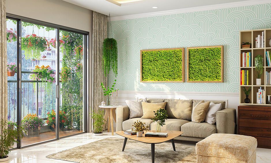
Green is often thought to be the most relaxing colour for the eyes. It also has a lot to do with nature, growth, and starting over. When it comes to interior design, green is a flexible colour that helps keep things in balance. It looks good in almost every room and can be used as a background when other colours are used. Rich emerald or olive greens add class and a sense of stability, while lighter greens add life and energy. Because it makes you think of nature, green is great for making a relaxing and healing space. It’s great for bedrooms, reading nooks, or even kitchens where you want to feel like there is a lot of natural wealth.
Orange to feel warm and connect with others
Orange is a warm, lively colour that comes from mixing the fiery red with the happy yellow. It’s often used to make a place feel warm and friendly, and it can bring people together. Orange looks great in living rooms, dining rooms, and other rooms where people meet. It looks best when paired with muted colours like terracotta, rust, or peach. These earthy shades of orange look classy while still making you feel warm and cosy. Just like red and yellow, orange should be used with care so it doesn’t ruin the mood of the room.
Purple is a colour of wealth and creativity
Purple has a sense of wealth and imagination that has been linked to royalty, mystery, and faith for a long time. Lighter colours, like lavender and lilac, make you feel dreamy and sweet. Darker colours, like plum or aubergine, add depth and drama. Purple is often used to encourage people to think deeply and creatively in their homes, quiet areas, or creative workshops. While purple is a more divisive colour than some others, it can make a room feel more classy and one-of-a-kind when mixed with neutral colours or added in small amounts.
Neutrals for Stability, Flexibility, and Style
A lot of furniture ideas are built around neutral colours like black, white, grey, brown, and taupe. Neutrals may seem easy, but they can have strong affects on our minds. Because white is associated with cleaning, light, and simplicity, it is perfect for making a room feel bigger and brighter. When it comes to soft or warm tones, grey gives off an air of calm and class. Beige and brown add warmth without drawing too much attention to themselves, making them great for putting stronger accents on top of. When you use black in the right way, it gives you a sense of depth, contrast, and stability. Neutral colours work especially well for making a balanced space where colour can be added in a planned way to evoke an emotional response.
Putting Colours Together to Make a Statement
A well-designed room doesn’t just use one colour. Finding the right colour choices that go well together and make the mood you want to create is the art of using colour in home design. For instance, putting together cool blue and warm wood tones creates a mix between calm and warmth. Adding touches of green to white can make it feel more fresh and full of natural energy. Adding a splash of orange or yellow to a grey room can make it feel better without taking away from its modern look. You can make places that feel complicated, intentional, and emotionally powerful by adding colours with care.
Finally, some thoughts on using colour in design
Colour isn’t just for looks; it’s a language of emotions that speaks directly to our health, happiness, and mood. Colour can turn a plain room into a safe haven, a productive space, a joyful gathering spot, or a peaceful escape if it is used with care. If you know the basics of colour psychology and pay attention to how different colours make you feel, you can create places that not only show off your style but also help you feel the way you want to every day. No matter how bright or dark, soft or strong, the colours you pick for your home can change how you feel about it in deep and lasting ways.